Most people think branding starts with a logo. Designers know better.The strongest brands in the world spend far more time debating fonts than logos, even though consumers rarely notice typography consciously. That is precisely the point. Fonts operate beneath awareness. They shape how a brand feels before a single word is read or a logo is recognized.
Logos are symbols. Fonts are systems. They appear everywhere: websites, apps, packaging, contracts, ads, invoices, and emails. While a logo may show up once, a font speaks constantly. This is why brands obsess over typography. It is not decoration. It is psychology at scale.
Fonts Carry Personality at High Frequency
A logo is seen occasionally. A font is experienced repeatedly.
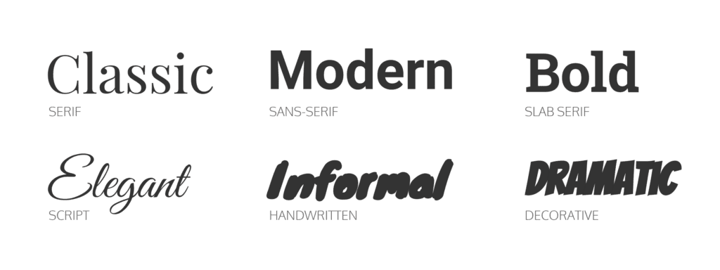
Every headline, button, caption, and legal disclaimer reinforces tone through typography. Serif fonts often signal heritage and trust. Sans-serif fonts feel modern and efficient. Rounded fonts feel friendly. Sharp edges feel authoritative.
This is why brands like Apple rely on clean, restrained typography. It mirrors their product philosophy: minimal, precise, confident. The font does not ask for attention. It communicates control.
Design research from MIT shows that people form emotional judgments about written content in under 50 milliseconds, largely based on typography. Before meaning lands, feeling does.

Logos Are Static. Fonts Are Scalable.
Logos rarely change. Fonts must work everywhere.
A brand font needs to perform across screens, sizes, languages, and contexts. It must be legible on a billboard and readable at 10 pixels. It must feel consistent in a marketing campaign and a customer support email.
This scalability is why companies invest millions in custom typefaces. In 2015, Google introduced its own font family to unify its sprawling ecosystem. The logo barely changed. The font did the heavy lifting.
Typography is infrastructure. Logos are landmarks.

Trust Is Built in the Smallest Details
Consumers rarely articulate why a brand feels “premium” or “cheap.” Typography is often the hidden reason.
Poor fonts signal carelessness. Inconsistent spacing signals disorder. Overly decorative type signals insecurity. These micro-signals compound into trust or doubt.
A 2022 study by the Design Management Institute found that consistent typography increased brand trust scores by over 30 percent compared to inconsistent visual systems. The effect was strongest in finance, healthcare, and technology, where credibility matters most.
This explains why banks, law firms, and luxury brands obsess over type. When stakes are high, details matter more.
Fonts Shape Memory More Than Logos
Logos are easy to recognize but harder to remember in isolation. Fonts, when used consistently, embed themselves into memory through repetition.
Think of Coca-Cola. The script typography is inseparable from the brand. Even without the logo mark, the lettering alone triggers recognition. That is not accidental. It is decades of typographic consistency.
Fonts create muscle memory. The brain remembers patterns it sees often. Over time, typography becomes shorthand for the brand itself.

Why Rebrands Often Start With Typography
When companies rebrand, logos get the headlines. Fonts do the real work.
Modern rebrands often simplify logos but overhaul typography. This is because fonts are easier to evolve without shocking the audience. A subtle type change can modernize a brand while preserving familiarity.
Logos are emotional anchors. Fonts are behavioral tools.
This is also why many startups delay logo redesigns but invest early in typography systems. They know the font will touch users more often than any symbol.This is also why many startups delay logo redesigns but invest early in typography systems. They know the font will touch users more often than any symbol.
Typography as a Competitive Advantage
In crowded markets, products converge. Features copy quickly. Design systems become differentiators.A distinctive font creates coherence across chaos. It aligns teams. It reduces friction. It makes content instantly recognizable even when logos are absent.
This is especially critical in digital-first brands, where users scroll fast and attention is scarce. Typography helps a brand feel familiar in milliseconds.
In simple terms, fonts help brands feel like themselves everywhere, all the time.
Conclusion: Logos Get Credit. Fonts Do the Work.
Brands do not obsess over fonts because they are picky. They obsess because typography is one of the most powerful, underappreciated tools in business.
Logos announce presence. Fonts sustain identity.
If branding is a conversation, the logo is the introduction. The font is everything that follows. And in the long run, what follows matters more than how you say hello.


