Walk into any Apple Store and you immediately feel something: calm white spaces, soft edges, and a distinct sonic signature that whispers simplicity and innovation. None of this is accidental. Sensory branding, once the domain of luxury houses, has become a mainstream strategy used by retailers, SaaS brands, startups and global giants alike. At its core, sensory branding is the art and science of using color, shape and sound to create emotional resonance that nudges consumers toward a purchase.
As digital and physical worlds blend into a unified commerce environment, brands that master sensory cues are gaining measurable advantages. According to a recent McKinsey behavioral analysis (2024), multisensory experiences can increase brand preference by up to 30 percent. In this article, we unpack the neuroscience, strategy and global best practices behind sensory branding and show how founders and brand leaders can implement these tactics today.

How Color Drives Emotional Decisions
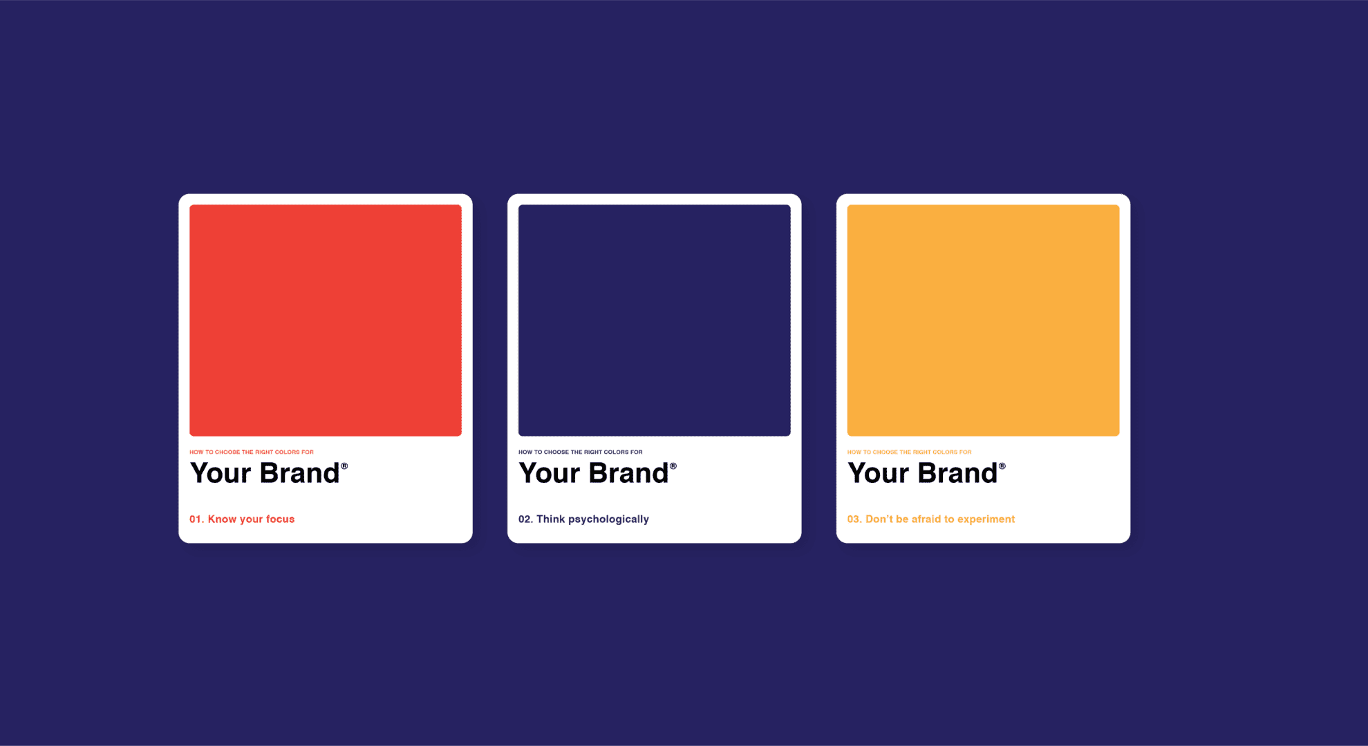
Color is among the fastest sensory signals processed by the brain. Within 90 seconds of exposure, 62 to 90 percent of consumers make subconscious judgments based solely on color, according to University of Loyola research.
The psychology behind brand colors
Color influences mood, attention and perceived value. For example:
- Blue: Trust, reliability, calm. Used by fintechs like PayPal and communication giants like Zoom.
- Red: Urgency, excitement, appetite. Dominant in Coca-Cola, Target and food delivery apps.
- Green: Wellness, sustainability, renewal. Preferred by organic brands and eco-first startups.
- Black: Premium, authority, exclusivity. Used by luxury fashion houses and automotive brands.
A 2023 Adobe Color Trends report found that brands using high-contrast palettes see a 20 percent lift in recall accuracy, especially in crowded digital markets.
Real-world case study: IKEA
IKEA’s signature blue and yellow are more than a nod to its Swedish heritage. Blue evokes trust and reliability, while yellow signals optimism and accessibility. Together, they make the shopping environment feel approachable despite large warehouse layouts.
Practical takeaways
- Start with the emotion you want your brand to evoke.
- Audit your color palette across touchpoints: app UI, packaging, social media.
- Use consistent color contrasts to strengthen brand recognition.
Why Shape Affects Brand Memory
Shape is an underrated but powerful driver of meaning. Neuroscientists at MIT found that humans identify and categorize shapes in as little as 20 milliseconds, making them essential for instant brand recognition.
Round vs angular shapes
- Round shapes: Suggest friendliness, softness and inclusivity. Think Spotify’s logo or the rounded UI elements used in wellness apps.
- Angular shapes: Signal precision, strength and high performance. Nike’s swoosh and Adidas’s three stripes create a sense of momentum and discipline.
A 2024 Journal of Consumer Psychology study showed that curved packaging increased perceived product safety by 15 percent, while angular packaging boosted perceptions of efficiency and power.
Real-world case study: Tesla
Tesla’s minimalist, sharp-edged logo reflects technological precision. Even the vehicle silhouettes reinforce this identity: sleek lines, aerodynamic forms and futuristic contours that signal innovation.
Practical takeaways
- Define whether your brand identity leans toward warmth or performance.
- Ensure your logo geometry matches that personality.
- Apply shape language consistently across UI components, display ads and product design.
Sound Branding: The Hidden Persuader
Sound is the sensory cue most likely to trigger memory. According to Harvard Business Review, brand sounds can increase consumer recall by 46 percent, making audio identity a crucial competitive advantage in video-first and voice-first ecosystems.
What makes a strong sonic identity
A great sonic brand has three characteristics:
- Distinctiveness: Immediately recognizable, like Netflix’s iconic “ta-dum”.
- Emotional accuracy: Reflects the brand’s personality.
- Consistency: Used across product, advertising and digital platforms.
The neuroscience behind it
When sound aligns with a brand’s visual identity, the brain forms stronger memory associations. Functional MRI research (2024, Stanford NeuroMarketing Lab) found that congruent audio-visual branding activates reward centers, increasing purchase intent.
Real-world case study: Mastercard
In 2023 Mastercard launched a global sonic identity heard in stores, apps and commercials. Within a year, the brand reported an 8 percent increase in customer recall and improved trust scores across 36 markets.
Practical takeaways
- Map out where sound naturally occurs in your customer journey: app notifications, onboarding flows, physical spaces.
- Avoid overly complex soundscapes; simplicity drives memorability.
- Consider voice consistency for AI assistants or automated phone systems.
Building a Multisensory Branding Strategy
Brands that integrate multiple sensory cues—color, shape and sound—achieve compounding effects. Deloitte’s 2024 Consumer Insights Review reported that multisensory brand experiences drive up to a 40 percent increase in perceived value compared to single-sensory stimuli.
Steps to build your sensory system
- Define your emotional core
Identify the single feeling you want customers to associate with your brand at first interaction. - Audit existing sensory cues
Review all digital and physical assets for inconsistency. - Develop a unified sensory guide
Include color ratios, shape styles, sound guidelines, notification tones and store ambiance notes. - Test with micro-experiments
A/B test landing pages with color variations, sound cues in onboarding, or shape changes in packaging. - Measure behavioral outcomes
Track scroll depth, average session duration, conversion rates and recall metrics.
Global example: Starbucks
Starbucks integrates color (deep green), shape (rounded mermaid silhouette) and sound (signature café ambiance) into a unified experience. This sensory triad enhances dwell time and drives premium perceptions internationally.
Conclusion: The Future of Sensory Branding
As attention spans shrink and markets saturate, sensory branding is becoming a critical frontier for competitive differentiation. The next era will prioritize adaptive sensory design: colors that shift based on user mood, dynamic sonic identities and AI-personalized shape experiences in digital interfaces.
Founders and marketing leaders who invest now in understanding how color, shape and sound influence buying behavior will not only strengthen brand loyalty but also position themselves ahead of changing consumer expectations worldwide.


