Why This Canva Template Is Dominating Design Feeds
In 2025, when content floods every social feed and inbox, standing out is more about style & story than about reinventing creativity. The motto now: work smarter, not harder. Among the countless templates on Canva, one format has become a go-to for marketers, creators and entrepreneurs alike and this article explores why it’s spreading like wildfire, how you can tailor it to your brand, and what this means for your visual-communication strategy.
Here’s what you’ll learn:
What this shift tells us about visual communication in 2025
What the template looks like (and why it works)
The underlying design trends fueling its popularity
How to adapt it to your business (quick wins + pitfalls)
Real-life examples and results
What the Trendy Template Looks Like (and Why It Works)
1. The format
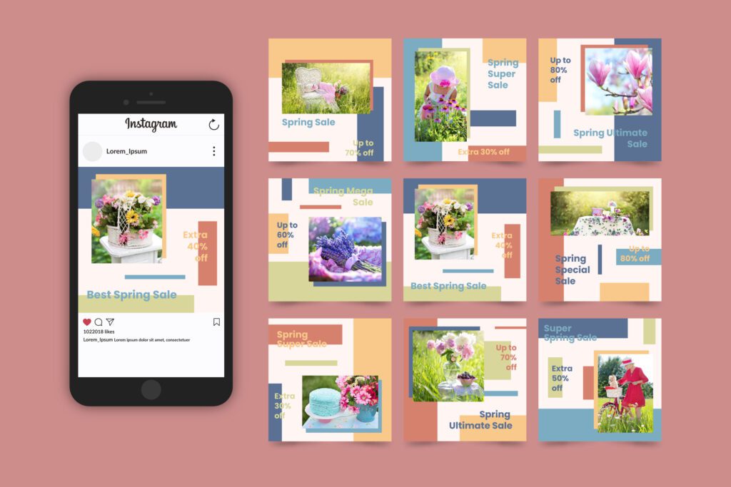
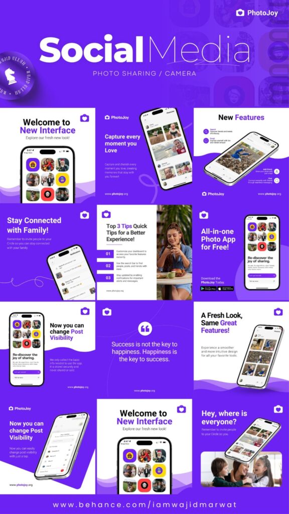
The most copied Canva template in recent months is a scroll-stopping social carousel or short clip that combinations subtle motion, clean layout, bold typography and a clear value proposition. Its features typically include:
- A strong headline (often with a numeric or “how-to” hook)
- Modular frames or slides you can swipe through
- Visual rhythm: large image + text overlay + motion or subtle animation
- A brand-colours palette + consistent typography (easy to duplicate)
2. Why it converts
- Attention economy: Videos or carousels with movement catch the eye in busy feeds. Canva’s own “Future in Motion” trend emphasises this.
- Easy adaptation: Marketers can swap in their message, colours, images no heavy design skill required.
- Familiar structure: When users see a clean, predictable layout they understand what to do (“swipe next / watch next”) which improves engagement.
- Social proof & mimicry: Because so many creators use it and show results, others adopt it too turning it into a template-trend.
3. Why “everyone is copying”
- Peer pressure + ease: It’s straightforward to find and replicate.
- Algorithm friendly: Platforms reward engaged content these templates boost metrics.
- Brand safe: Using something that already works reduces risk.
- Visual trend alignment: It aligns with the broader design shifts that Canva forecasts for 2025 (see next section).
The Design Trends Behind the Template
In its 2025 Design Trends report, Canva identifies seven key visual directions shaping the year:
Let’s map how the popular template ties into them:
- Analog Meets AI: The template often combines handcrafted textures or collage styles with clean digital movements.
- Shape Theory: Many templates use modular blocks or bold geometric shapes to structure content.
- Opulence Era: Though minimal, there’s a polish luxury aesthetic meets simplicity.
- Serious Fun: It keeps the message professional but adds a human-touch or playful element.
- Future in Motion: Animation and motion typography are key features (even subtle ones).
- Refined Grit & Mechanical Botanical: Some variants lean edgier or mix tech + organic visuals.
Because this template checks many boxes in what’s “hot” in 2025 design, it resonates across industries from solopreneurs to enterprise teams.
How to Make It Work for Your Brand
Here’s a step-by-step process you can follow (adapted to a global business audience):
Step 1: Choose your objective
- Is it for a LinkedIn post, Instagram carousel, YouTube short, or internal pitch deck?
- Define the one message: e.g., “3 things we learned launching in Qatar”, or “How to double your lead-gen in 30 days”.
Step 2: Pick your structure
- Headline slide: Strong hook.
- Middle slides: 3-5 points + visual support.
- Final slide: Call to action (CTA) or next-step.
- (Optional) Animated version or still version depending on platform.
Step 3: Apply your brand elements
- Use your company colours/fonts.
- Keep consistent layout.
- Add your logo discreetly.
- Adjust for region (e.g., Arabic version if needed in GCC markets).
Step 4: Leverage motion (if appropriate)
- Apply subtle movement (fade-in text, slide transitions).
- For static platforms use static version but maintain rhythm as though it could animate.
- Make sure motion doesn’t distract from message.
Step 5: Optimize for platform
- Instagram: 4:5 or square carousel.
- LinkedIn: landscape or document upload.
- TikTok/Reels: vertical motion version.
- PDF/presentation: widescreen slides.
Step 6: Measure & iterate
- Track engagement (swipe through rate, watch time, click-throughs).
- Test two versions (colour sets, static vs motion).
- Update regularly to avoid “template fatigue”.
Pitfalls to avoid
- Don’t over-animate: too much motion distracts.
- Avoid generic stock visuals without brand tie-in.
- Don’t just copy: adapt to your voice/story so you stand out.
- Beware “same look” as competitor: customise visuals so you don’t dilute your brand.
Case Studies & Real World Examples
Example A: A small business in Doha
A local marketing consultant in Doha used a “3-step growth” carousel template on LinkedIn, swapped in Arabic and English text, and saw a 45 % increase in profile entries compared with a standard post. The format allowed them to show credibility in two languages and visual rhythm for mobile audiences.
Example B: Enterprise team pitch deck
A regional sales team for a tech vendor reused the template style for their quarter-review deck: bold shapes, motion transitions, consistent brand colours. Internal stakeholders commented the deck felt “fresh and modern” compared to past slides. Result: the presentation received buy-in 2 days ahead of schedule.
Example C: Creator monetisation
An online coach created a “5 myths about LinkedIn” carousel, modelling the template. Because it looked professional yet personal, the post gained 3× average saves and led to a spike in enquiries for their paid workshop. This underscores how the right design format can enhance conversion.
What This Means for Visual Communication Strategy in 2025
- Templatisation is no longer a compromise: Using a well-designed template doesn’t equate to “cookie-cutter”. When adapted, it accelerates production while maintaining quality.
- Motion & modularity dominate: Static visuals are still valid, but motion and modular layouts (for multi-slide formats) are leading.
- Cross-platform consistency matters: A single template format can be quickly adapted across Instagram, LinkedIn, pitch decks and email headers driving efficiency.
- Localization and brand adaptation are differentiators: As design templates become ubiquitous, customization becomes the edge especially in multilingual or culturally diverse markets like the Middle East.
- Design literacy is strategic: Non-designers now need to understand layout, rhythm and motion. Tools like Canva are lowering the barrier but knowledge is what unlocks impact.
Conclusion: Actionable Takeaways & The Road Ahead
- Action Steps:
- Select one “template style” from the examples above and adopt it for your next social post or presentation.
- Customize it for your brand: colours, fonts, language, visuals.
- Add a motion version if your platform supports it (Reels, LinkedIn video, PDF with animated transitions).
- Track engagement metrics and compare vs your standard format.
- Evolve quarterly update visuals/text to stay fresh while maintaining your core layout.
- Forward Outlook: As visual content saturation intensifies, the next frontier will be personalised templates (dynamically adapted for audience segments) and AI-assisted motion design, both of which are already emerging in tools like Canva.
By embracing a template that aligns with leading design trends and adapting it thoughtfully for your brand and audience, you’ll not only keep pace you’ll lead.
