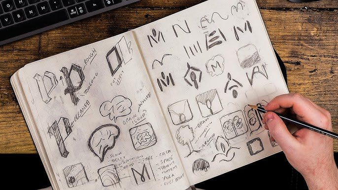
Why Imperfection Sometimes Wins
Conventional wisdom says a logo should be polished, professional, and instantly recognizable. But history shows us that not every successful brand starts with or even keeps a “perfect” logo. In fact, some of the world’s most iconic companies grew with logos that design critics once called clumsy, awkward, or downright bad.
A 2023 Nielsen survey revealed that 59% of consumers are more likely to remember a brand with a distinctive but imperfect logo than one with a generic polished design. This suggests that imperfection, when authentic, can actually fuel brand growth.

Imperfect Logos Are More Memorable
Research in visual psychology shows that humans remember unusual patterns more than perfect symmetry. A rough or “bad” logo stands out because it breaks expectations. Think of Comic Sans-like fonts or scribbled designs unpolished, but unforgettable.
Lesson: Standing out matters more than looking perfect.

Authenticity Over Aesthetics
Some founders design their logos themselves to save costs, and those DIY marks carry authenticity. Consumers often connect with the human touch of imperfection it feels personal, like a story rather than a marketing stunt.
Lesson: A logo that reflects real beginnings can resonate more than one designed for perfection.

The Viral Effect of “So Bad, It’s Good”
Bad logos can spark conversations online. Whether mocked or memed, they generate free publicity. For example, local restaurants or startups with quirky logos often gain unexpected exposure when people share them for entertainment.
Lesson: Controversy can be a marketing tool if you embrace it.

When Bad Logos Hurt and When They Don’t
Of course, not every business benefits from a poorly designed logo. High-trust industries like banking or healthcare may lose credibility. But in creative, food, or startup industries, an unpolished logo often signals creativity, scrappiness, or even rebellion.
Lesson: Context matters what’s “bad” in one sector can be powerful in another.

From Bad to Iconic
Many billion-dollar companies began with logos that designers hated. Google’s rainbow font, Amazon’s early busy logo, and even Apple’s original illustrated crest were far from perfect. Their evolution proves that a “bad” logo doesn’t block growth it can simply be a starting point.
Lesson: A bad logo won’t stop a great business idea.

Conclusion: The Beauty in Imperfection
The hidden power of bad logos is that they break the myth of perfection. They show that authenticity, memorability, and story can outweigh polish especially in the scrappy early stages.
The takeaway: Don’t let design anxiety hold you back. A “bad” logo might be the imperfect tool that makes your brand unforgettable.
FAQs
1. Can a bad logo still help a brand grow?
Yes if it’s memorable, authentic, and aligned with the brand’s story.
2. Why are some bad logos more successful than polished ones?
Because they stand out, feel personal, and sometimes spark conversation.
3. Should startups invest heavily in logos early on?
Not always focusing on product and customer experience often matters more in the beginning.
4. Do companies eventually redesign their bad logos?
Often, yes brands evolve their visuals once they scale, but many keep traces of their original identity.
5. What’s the main risk of a bad logo?
In industries requiring high trust (finance, healthcare), a poor logo can signal unprofessionalism.


